
There has been a lot of talk about interface design with the latest releases of operating systems for smartphones including Android, iOS and Windows Phone. Popular interface styles have recently come in and out of fashion like skeuomorphism and flat design. Skeuomorphism focuses on making design elements represent their real world counterparts. Flat design focuses on colored background with icons, void of any miscellaneous design elements. These juxtaposed design styles bring to mind the elements and principles of design and which styles are appropriate for a specific situation.
Shapes
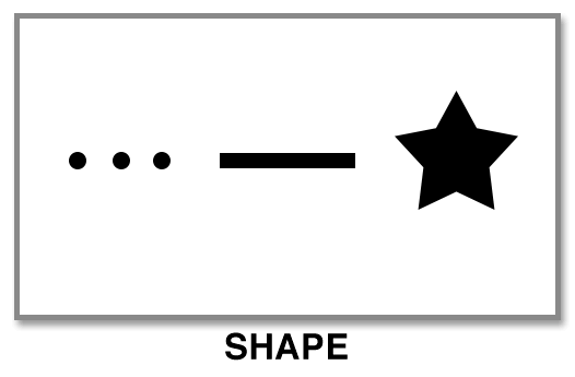
Shapes are used to create elements within a design that lend their form to the composition. There are three basic shapes that designers utilize, points or dots, lines, and geometric shapes. These elements can be used separately or in unison to create an area of focus, direct the viewers eye, create motion, and illustrate hierarchy.
Color
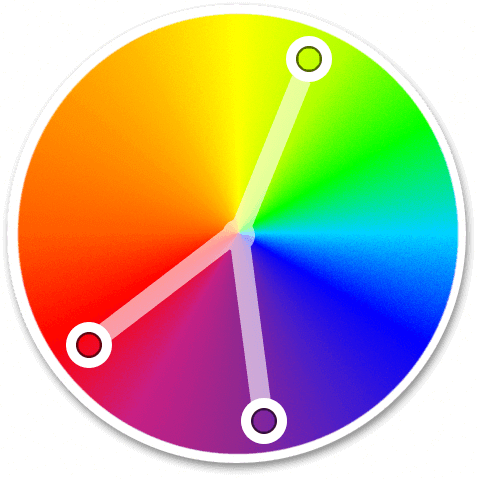
The use of color is important in design as it can imply feeling, atmosphere and mood. Color can be applied to a design as a solid or gradient with a variety of hues, values and saturation. Color also holds many different meanings depending on the cultural audience. For more information, read our article on “Color and Cultural Meaning.”
Contrast
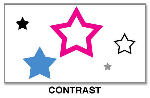
Adding visual interest to a design can be accomplished with contrast. This could be done with contrasting color, light and dark values, or the size of shapes on the canvas. These contrast in variations draw the viewer through a composition and help establish a hierarchy or create the illusion of three dimensional space commonly referred to as depth of field.
Texture

To give illusion that objects have material properties, textures can be applied to them. A common source for textures come from photographs like concrete, paper, and nature. Textures can also be generated from patterns that artists develop, which are repeated across an area on the canvas.
Grids
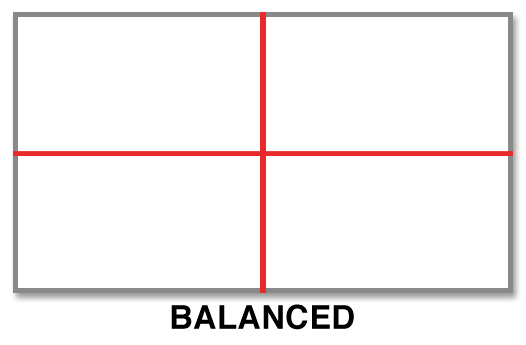
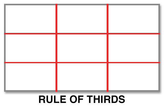
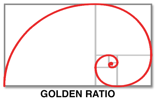
A critical but hidden element of design is the grid. Grids are used to align objects or points of interest to create an implied sense of structure on the canvas. The Balanced grid is accomplished by centering all objects either vertically or horizontally on the canvas. The Rules of Thirds grid creates two vertical and two horizontal lines across the canvas, dividing the canvas into thirds. The Golden Ratio is often found in nature and believed to be the most aesthetically pleasing grid. Based on the Golden Rectangle (The long side of the rectangle divided by the short side is mathematically equal to the Golden Number 1.618), the Golden Ratio creates a spiral arch when a line is drawn through the intersecting points leaving a focal point in one third of the canvas.
Harmony
When elements on a canvas relate and complement each other, it creates harmony. One aspect of harmony is repetition of a visual motif or design element. This creates a visual rhythm that emphasizes an area, object or arrangement. The same can be said of visual space which can isolate objects and direct the eye to an area of emphasis.
Which is right for my situation?
With the different elements and principles of design, you might ask yourself, “which design style is right right for my situation?” Personally, I believe it is better not to follow design trends as they go in and out of fashion frequently. It is best to create a design style that represents the business’ objectives, target market, and audience demographic. This will ensure that your website or interface design will remain relevant regardless of which design trends are in or out of fashion. Allowing the business to build a unique brand that will differentiate it in the marketplace and always be in fashion.