
Color is an amazing tool that helps communicate ideas effectively. Have you ever had to pick out paint for a room? I’m guessing you know there are a lot of colors to choose from. It can be difficult to know which colors work well together and which contrast. Below we will take a quick look at the basic principles of color harmony and how we can use them to our advantage when choosing colors for a website.

Primary Color
Refers to pure red, yellow, and blue. These colors that can be mixed together in various amounts to create every other color.

Secondary Color
These are orange, green and purple. These hues are achieved through mixing the adjacent primary colors together.
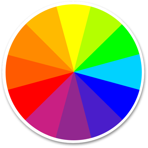
Tertiary Color
As you might guess, these hues are achieved by mixing the primary and closest secondary color together.
Color Harmony

Complementary Colors are directly opposite from one another on the color wheel. When used together in a design they contrast and reinforce the other. Common complementary color groupings include red-green, yellow-purple, blue-orange.
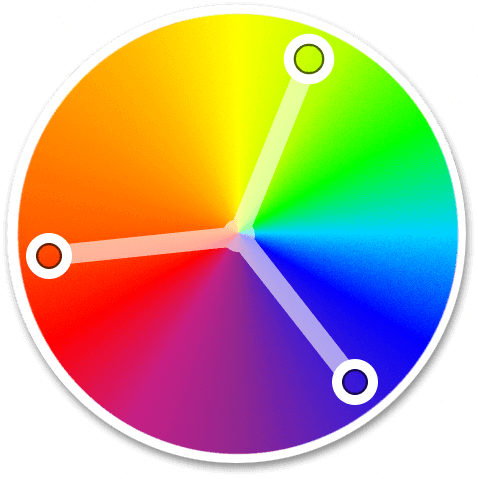
Triad Colors are three equidistant hues on the color wheel. When used together they create a colorful and balanced color scheme.

Analogous Colors are from across a consecutive range of hues. When used in a design these colors feel harmonious and lend themselves to a feeling of nature.
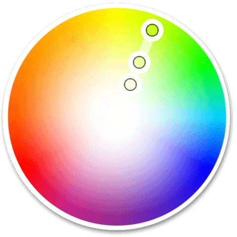
Monochromatic Color is a single hue and variation of that hue’s tint, shade and saturation. Using saturation and tint variations inside any color theme is always good practice. While I would be hesitant on using a fully monochromatic color scheme as it might become visually monotonous. To avoid this, use white, gray, or black to introduce some contrast.
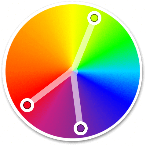
Split Complementary Color is a color and the related complementary analogous hues. Using split complementary colors on a website can provide a high degree of contrast without being as intense as complementary colors.
Please Use Restraint
Sometimes you can go overboard with colors. If you use too many colors your page will become busy and difficult to read. Remember all those beautifully hard-crafted MySpace pages?
… But Not Too Much Restraint
Other times you want a very modern website that utilizes a lot of blacks and white space. This could become sterile and possibly boring without any color. A small introduction of a highlight color will accent portions of the page to draw the users eye to your call-to-action.
The Golden Trilogy
This is a simple principle of using three colors on a site that reinforce and contrast nicely in the User Interface elements. This lends itself to unique ways of guiding the users eye across a page.
- Primary color: This is the color that sets the tone for the design of the webpage. It is applied across a majority of the page.
- Secondary color: This color reinforces the primary color and is used to enhance the appeal of the site. Most of the time the secondary color is located near the primary color on the color wheel.
- Highlight color: This color should stand out against the primary and secondary color. It is common for the highlight color to be a complimentary or split-complementary color. This accent color helps guide the users eye to portions of the page like a callout or a call-to-action button.
There are many possibilities that can be achieved with different color combinations. You will never run out of color combinations so experiment with colors and find which ones work best for your website.